Niice Studio worked closely with Phaidon International, a global leader in recruitment to develop a new brand and digital experience that better showcases their leadership in the sector

Branding / UX / UI / Branded Space / Responsive Design / Design systems
Where talent meets opportunity
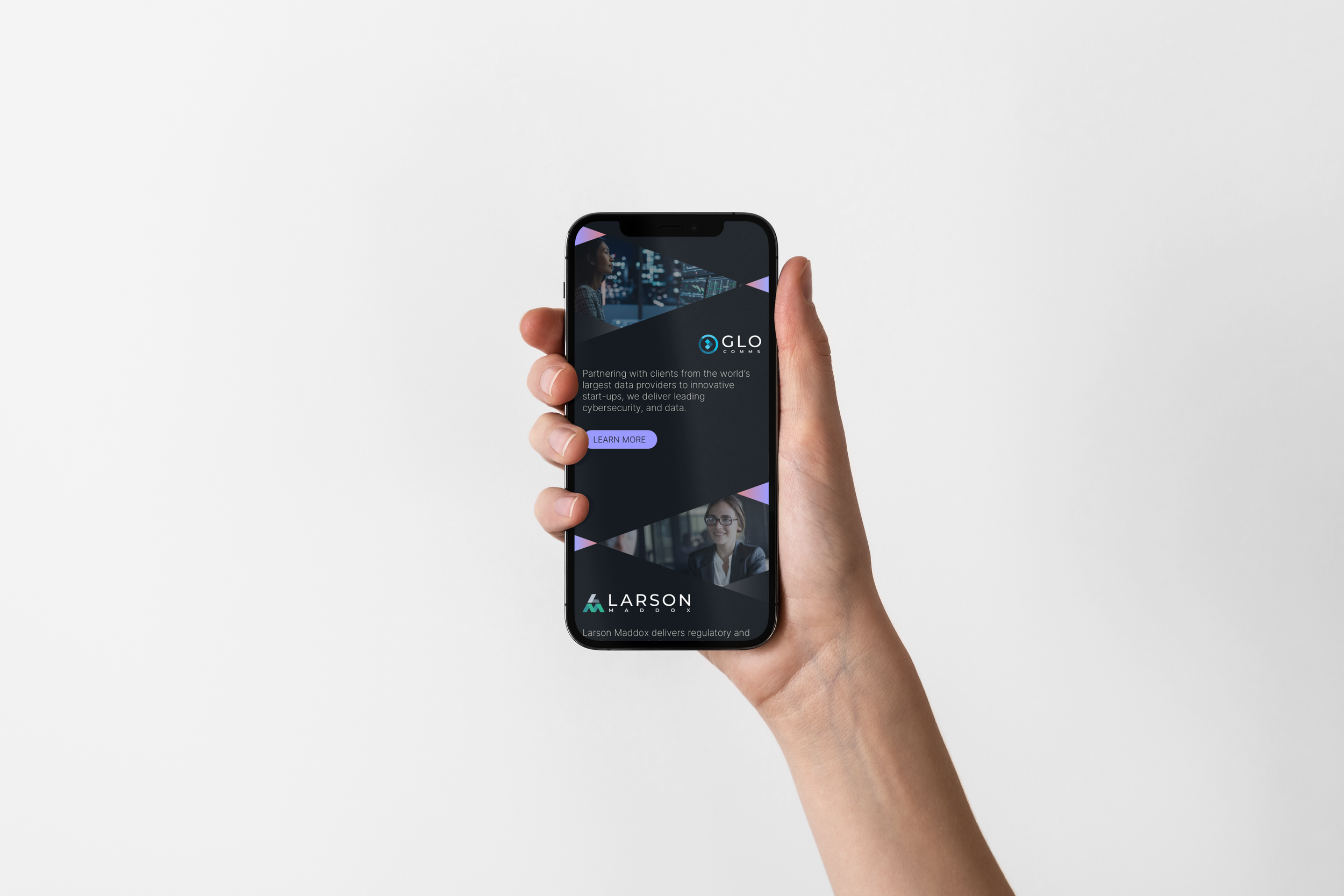
Phaidon is a global staffing group operating across six specialist sectors: Corporate Banking & Investment Management, Energy & Infrastructure, Logistics & Distribution, Life Sciences, Global Communications, and Legal & Compliance.
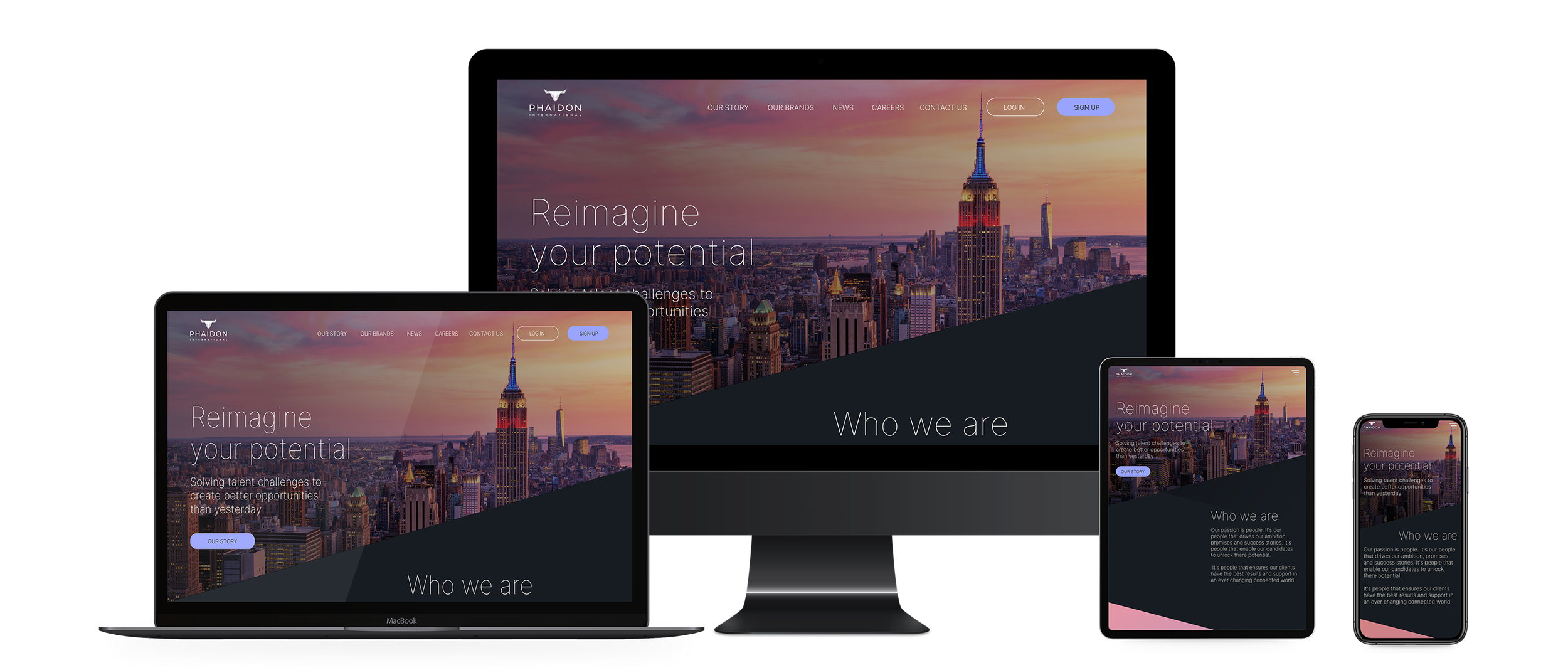
We worked with the Phaidon team to develop a new brand identity, digital and tone of voice, — one that could unify the group while giving space for each brand to stand apart.


The connection between talent and opportunity
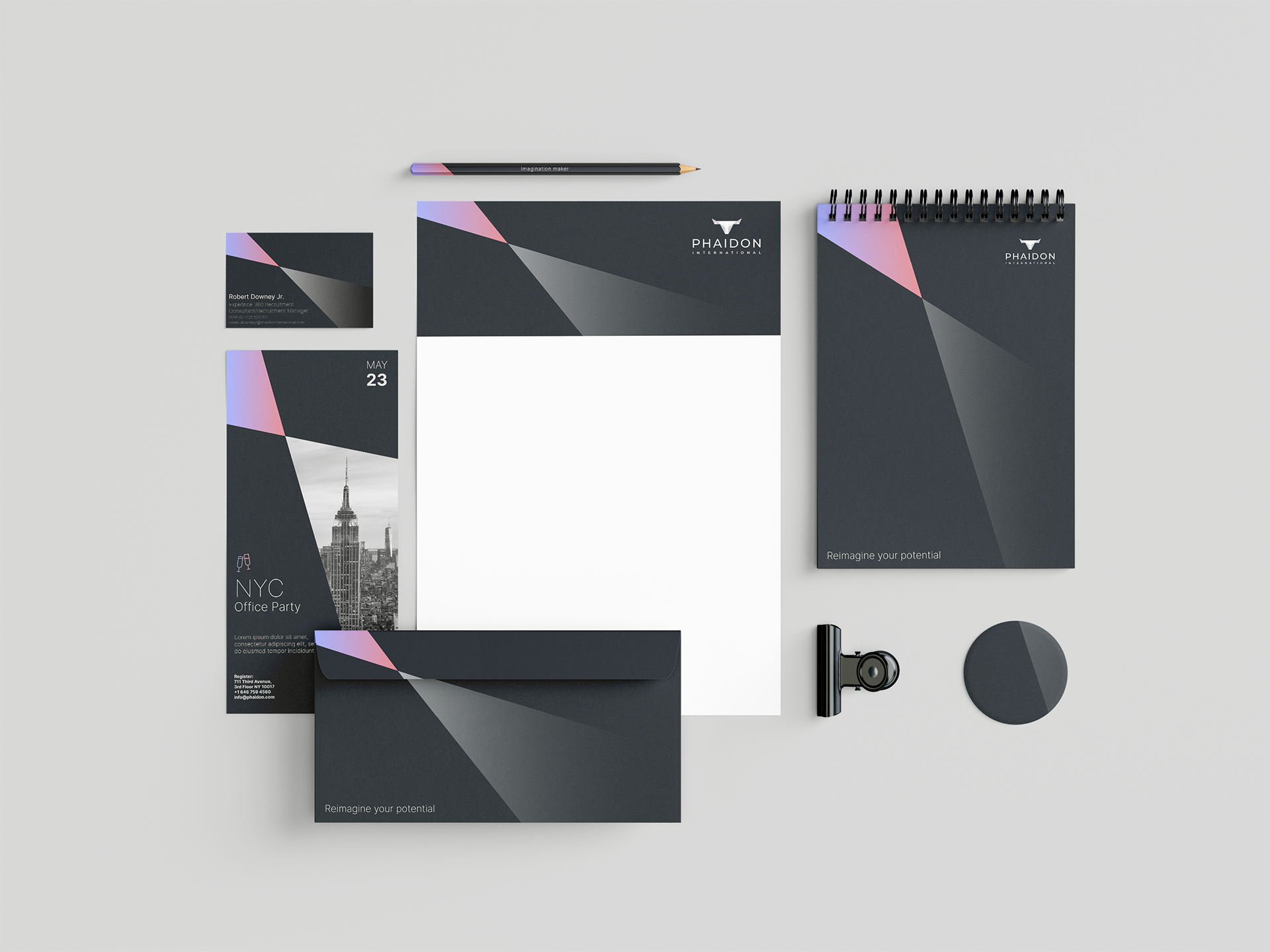
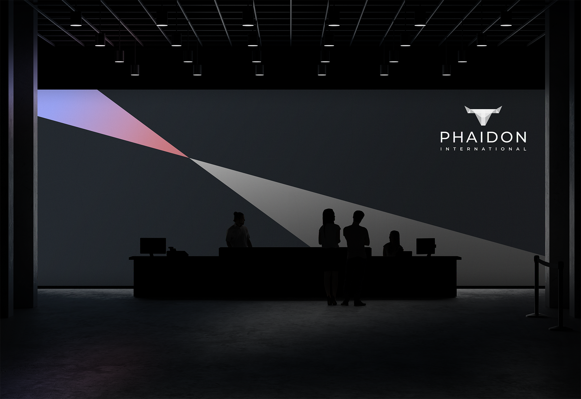
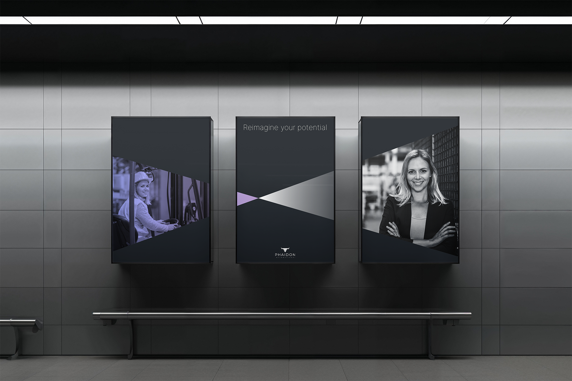
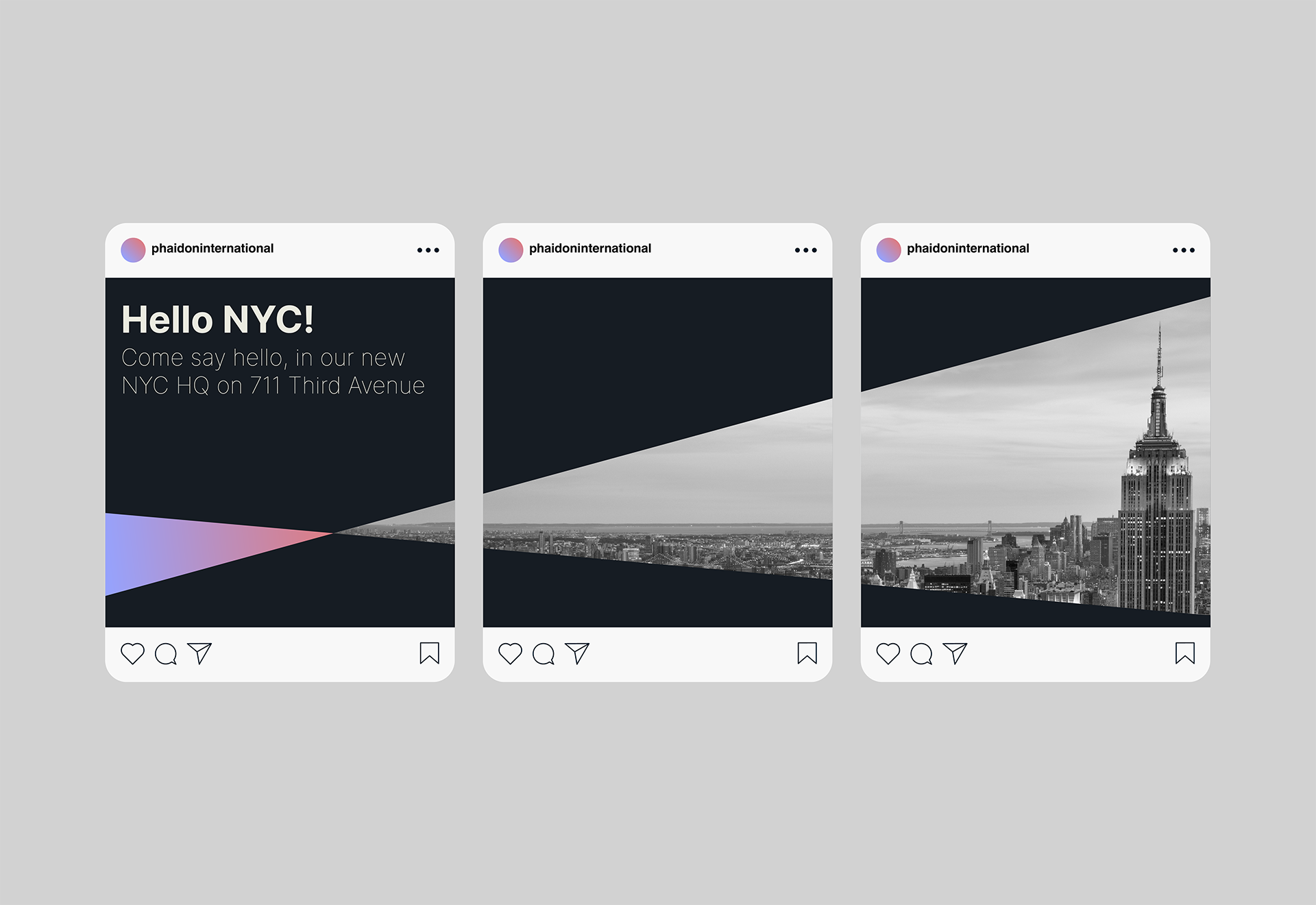
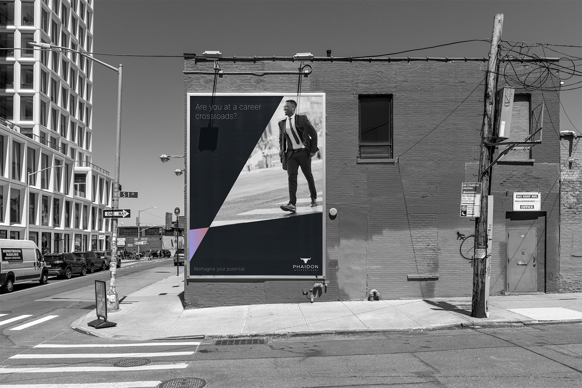
Inspired by Phaidon's bull symbol, the new design language uses sharp, angular shapes to express momentum, precision, and the connection between talent and opportunity. At the core of the system is a pair of intersecting angles: the first — the light angle — represents Phaidon itself: a source of clarity, direction, and opportunity. The second acts as a container for the outcome of that light — a space that holds richer, more human content.
That might be a successful candidate, a new recruit, a member of the team, or a landscape drawn from one of Phaidon’s six specialist sectors. These forms adapt across everything from print to digital to physical environments.

A Global brand rollout across all of Phaidons global presence
We led the rebrand rollout across all 15 of Phaidon’s global offices — from Amsterdam to Zurich — including branded spaces, wayfinding, and environmental graphics.
We also redesigned Phaidon's recruitment onboarding pack — creating a clearer, more engaging entry point for new hires joining teams across the world.